# Component Panel
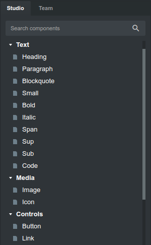
The Component panel holds all components that are available in Mail Studio. You drag and drop them to assemble your design. The panel is split into two tabs - Studio for the built-in components, and Team where you can share components with team mates securely.
# Component Groups
The built in components in the Studio tab are organized into categories which we call groups. There are components like Heading, Paragraph and Div which directly represent an HTML element. But you can also find more complex components like Navbar, Button and Accordion which have been built and tested by our team with maximum compatibility with different email clients in mind.
# Favorites Group
To make it easier to find the components you use most often, you can right click them and choose "Add to Favorites". This will display your components in a special Favorites group near the top of the Component panel.
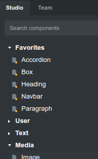
# User Group
Mail Studio gives you the ability to save and reuse pieces of HTML and CSS in the form of User Components. This is great for things which you use often like headers and footers, which can be included in any page via drag and drop.
To create a custom component, right click an element on your page and choose the "Add to Library" option.
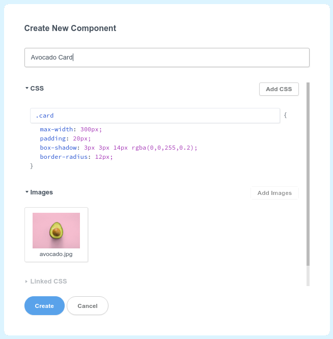
In the dialog window that is shown, enter a name and choose the styles, images and fonts (if any) you would like to include together with the component.
The component is now saved locally in the Component panel's User group and can be dragged and dropped into any design.
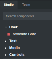
Later, when you drag and drop this component into a design, the styles and assets you've chosen will be added automatically if needed.
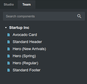
# Team Tab
By right clicking your custom component and choosing "Share with Team..", you can publish it to our Team's private online library. It will be available to all members of your team and can be dragged and dropped into any design. This way you can maintain a company-wide library of reusable UI elements that will save you time when creating new designs.
To unshare a component, just right click it and choose Unshare.