# Row
Row components are a fundamental part of the Responsive Grid. Use them to build responsive layouts that adapt to the available screen size.
# Basics
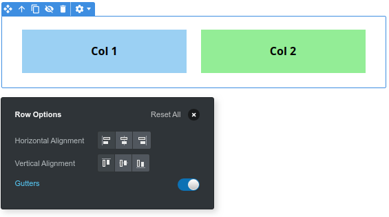
Drag and drop a Row component from the Component panel to the stage, and select it. In the top section of the application window you can see the Row toolbar.

It consists of the following controls:
- Alignment buttons - These control how columns are positioned in the row (more on this below).
- Add to Row - A button for quickly adding a Column.
In the Row Options (right click and choose Options..), there is an additional setting available for displaying Gutters. This is spacing around columns which can come handy in certain designs.

TIP
It's recommended that you drop rows inside containers instead of directly in the body, so that your content is properly centered.
# Column Alignment
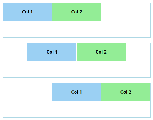
By choosing the Alignment buttons in the Row toolbar, you can control the positioning of the icons within the Row.
# Horizontal Alignment
The horizontal alignment (left, center, right) works as you would expect - columns that don't take the full width (aka narrower than 12/12ths) are shifted in the chosen direction (left, enter or right).

# Vertical Alignment
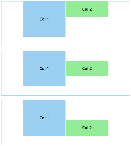
Vertical alignment is a bit different. Due to limitations in the HTML and CSS support in email clients, vertical alignment controls only columns' relation to each other, and not how they are positioned in the row.
For example, let's say that we have a Row which we've set to a 180px height. The two columns inside it are 140px and 60px tall. We set the vertical alignment to top, middle and bottom.

As you can tell from the image, the columns only shift relative to each other, not the row. Normally this isn't a problem - Rows shouldn't have a height set, but should instead grow to accommodate the height of their columns.
If your design calls for a row with a height and vertically centered columns, instead of giving the Row a height, you can give it to its parent. And then place a Spacer component right before the Row to center it vertically.
