# Designing Responsive Email
Mail Studio gives you a number of tools, components and techniques for creating responsive email designs.
# Responsive Appearance Options
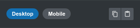
The most straightforward way to adapt a design for mobile devices is to use the Desktop and Mobile tabs in the Appearance panel.
Mail Studio offers support for overriding a lot of style properties this way. The process is simple. Style your email the way you wish to look on desktop, resize the canvas to the mobile view, and adapt the properties, so that the design looks good on small screens.
# The Grid
When you need your layout to change between mobile and desktop, the grid is the answer. The implementation you will find in Mail Studio is similar to front end frameworks like Bootstrap.
Here are the basic concepts:
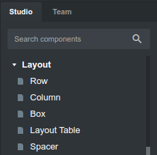
- The grid consists of a Row and one or more Column components inside it.
- You can place Rows anywhere on the page, including inside Columns, thus creating a nested grid.
- The Row takes the full width of its parent.
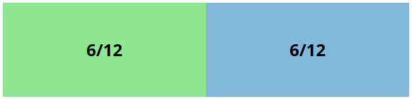
- Columns can take a certain part of the Row, from 1/12th all the way to 12/12ths (taking the entire width of the row).
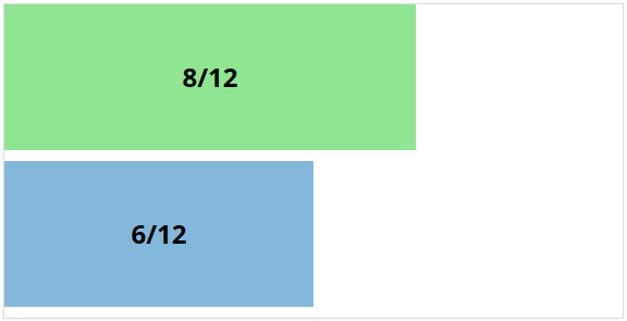
- Columns sit next to each other on the same line inside the row, but if their widths exceed 12 parts, the first column that doesn't fit breaks onto a new line.
- Columns can have different widths on desktop and mobile.
What makes the grid so useful, is that you can set columns to have different widths on Mobile and on Desktop. This gives you a great deal of control over how your email designs adapt to different screen sizes.
# Grid Examples
Let's see some examples to make the grid easier to understand.
# Equal Sized Columns
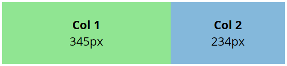
# Two Columns, One 2x the Other

# Breaking Out to a Second Line
# Responsive Grid
Here is the most common responsive grid technique. By setting the columns to take half the width on Desktop (6/12) and the entire width on Mobile (12/12) we compensate for the lack of horizontal spacing on smartphones.
# Conditional Visibility
You can use the Visibility options in Mail Studio to construct designs that need complex changes between their desktop and mobile views. This makes things that can't be done with the responsive grid possible.
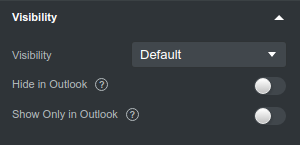
The heart of the technique is constructing two sets of components. One will be shown only on desktop, and the other - only on mobile. This opens the doors to complex interactions. Here is an example.
In this design we show a link to a landing page on desktop clients, and direct links to the App Store and Google Play on mobile.
# Layout Table
Layout Table is a Mail Studio component which lets you build a grid with fixed column widths that don't resize on smaller screens. Columns also don't flow to new lines, they are guaranteed to be next to each other.
It can be useful if you want a certain piece of your design to have a fixed size and don't care about responsiveness, or you just hide it on mobile with the Conditional Visibility options and show another component entirely.
# Box
The Box component exists to give you an easy way to add margins and paddings that work on every email client. Box achieves this by using two nested tables, one for the margins and another for paddings. But you don't need to worry about the messy HTML, Mail Studio handles everything for you.
To use Box in a responsive design, set Responsive Appearance Options for margin/padding on mobile.
# Spacer
The Spacer is used to add vertical spacing between components. On the web we would achieve this by setting bottom margins, but this rarely works in email clients.
Spacer is a table with a fixed height. You make it responsive by showing and hiding different size spacers on desktop and mobile with the help of the Conditional Visibility options.
# Media Queries
If you are well versed with CSS, you can achieve anything by writing code in the CSS Editor. Every CSS block can have a media query applied. By writing code like this:
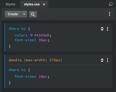
We can make the heading smaller on mobile devices:
Note on Breakpoints
It's recommended to use only a mobile breakpoint (screens smaller than about 600px). You might want extra breakpoints for tablets, laptops, desktops and so forth, like we have on the web but they won't work in email. Most web clients (including Gmail, Yahoo, Hotmail and more), render your email in a small area on the page, surrounded by side panels and ads. So your media query for 1400px might activate, but your email might get only 700px.
Note on Testing
When using the Appearance panel, Box, Spacer and the other responsive techniques, Mail Studio handles compatibility for you. We work hard to make sure they work on all email clients. But when you write CSS code manually, it's up to you to test your design in all clients you wish to support.