# Accordion
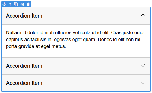
The Accordion is an advanced component which displays sections of content one at a time, making better use of limited screen real estate.
On email clients where CSS support is lacking, accordion items are expanded and cannot be collapsed. In modern clients (like iOS Mail) the accordion expands on clicks, bridging the gap with what's possible on the web.
# Basics
Drag and drop an Accordion component from the Component panel to the stage. In the Overview panel, you can see all the components that comprise the accordion.
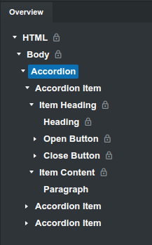
The accordion consists of Accordion Item components, each with Item Heading and Item Content. These components are locked to prevent accidental deletions, but you can easily customize them.
To edit the text of the accordion, just double click the heading or paragraph. You can also add more components (text as well as images) in the Item Content.
← Navbar Custom Code →