# Layout Table
Layout Table is a component which is an alternative to the Responsive Grid. It still consists of Rows and Columns, but it isn't responsive. Columns always sit next to each other, and never flow underneath one another. This can result in horizontal scroll bars on small screens if you are not careful.
# Basics
Grab a Layout Table from the Component panel and drop it in your page. It can be placed in any component. Keep in mind that Layout Table won't shrink and might lead to horizontal scroll bars on small devices if it's too wide.
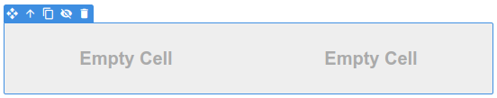
You can add additional rows and columns to your table from the Toolbar:

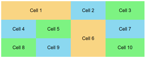
You can achieve more complex grids by "merging" neighboring cells. To do this, right click a Table Cell, and choose Options...
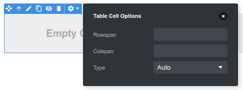
Here you can set the rowspan and colspan properties, which determine how many positions the cell would take. Keep in mind that if you increase the colspan of a cell you will need to delete one of the other cells on the row so that all rows contain an equal number. The same goes for rowspan - if increased you will need to delete one of the cells from the row above or below.
# When to Use
Layout Table is useful in cases where you need precise pixel widths for your columns, and the total width of the entire table doesn't exceed 320px, so that it will always fit in screen.
If you need a wider table than this, you can show Layout Table only on desktop, and hide it on small devices with the Conditional Visibility options, while showing a mobile optimized version in its place.
# Differences with Table
If you browse the markup of the Layout Table component in the HTML tab, you will see that it's basically a regular table. The main difference with the Table component is that Layout Table sets the role="presentation" attribute, which indicates to screen readers that the table is for layout purposes only and its contents shouldn't be read cell by cell.