# Appearance Panel
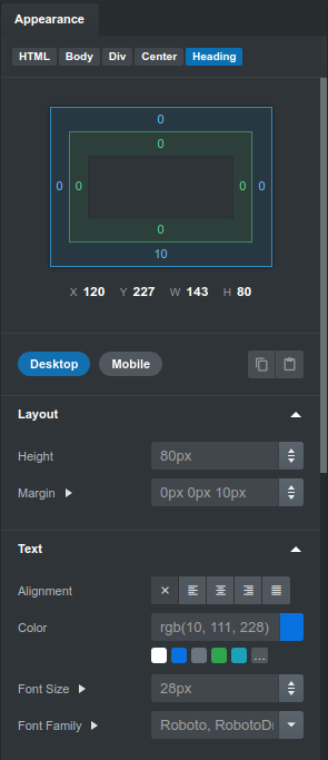
When you select a component in Mail Studio, the Appearance panel is populated with a multitude of options that let you modify its look and feel. When you make changes, the app intelligently applies all the needed CSS properties and attributes, so that your emails look great on every client.
# Responsive Styling
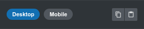
One innovation which Mail Studio brings to the email design field is the way in which responsive styling is handled. It's done with the help of these two buttons - Desktop and Mobile. By switching between these two, you change on which breakpoint the options below them take effect.
You can achieve a lot with this simple mechanic. Things like responsive spacing, widths and font sizes are now straightforward to do, just give one value for Desktop, and a different one for Mobile.
Behind the scenes, this is achieved by Mail Studio generating media queries for your Mobile properties, so that they are applied only on screens smaller than 557px. The application minimizes the needed CSS code to only what you use, so your designs are as light as possible.
You can learn more about responsive email design in our dedicated guide.
Note
The designs you create with Mail Studio are desktop-first, meaning that mobile styles inherit the values of desktop ones if not set. Clients like desktop Outlook and Windows Mail, which don't support media queries, stay fixed on the Desktop view at all times.
# Options
Depending on the selected component, Mail Studio gives you a number of options which you can modify. Keep in mind that not every component supports every property - the app only shows those which are guaranteed to work across email clients.
Note
Mail Studio will show only Appearance options which we've tested to work on all clients. However, if you prefer, you can easily work around this limitation by writing code in the CSS editor by hand. If you go this route you will need to test your emails to make sure that they work in the email clients which you wish to support.
# Margin, Padding
These let you control the margin and padding properties of the component. The margin is the empty space outside of a component, and padding - the space inside it.
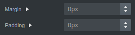
Although basic, these properties have quite poor support on Outlook and Windows Mail, with very few elements supporting both. Most notably Paragraph and Heading components don't support padding in Outlook.
The Box component gives you a great workaround, because we've developed it to support Margin and Padding everywhere. If you need only vertical spacing, the Spacer component is also a good alternative.
TIP
You can click the Margin label to reveal margin-top, margin-bottom, margin-left and margin-right sub properties. The same goes for Padding.
# Width and Height
Width and height have generally good support in all email clients. You can enter values in pixels (px) and percentages (%), and drag the handles on the right to increase the values quickly.
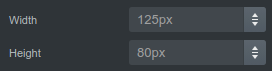
It's worth keeping in mind that setting explicit width and height values may make your design not fit on mobile screens and break responsiveness. Because of this, it's preferred to use the Responsive Grid instead, and leave elements to take the full width of the grid columns.
# Text Alignment and Color
These are only shown on textual components like Paragraph, Heading and Span. Changing the text alignment between mobile and desktop is a frequently used technique for making responsive emails better.
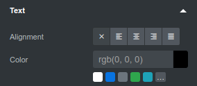
Below the color field you can see a number of rounded color squares. These are previews of your design's CSS variables, and clicking one of them will fill the field with the corresponding var(--color).
# Font Size and Family
These are shown on textual components like Paragraph, Heading and Span, but also on the Body.
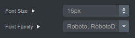
Setting these properties on the Body lets you change the font of your entire design from a central location. Mail Studio supports Google Web Fonts and even custom fonts which you can import.
# Background Color and Image
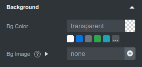
Background colors are supported on most elements, but special care must be given for background images. Since the latter don't work in Outlook and many email users have images disabled, it's recommended that you choose a suitable background color alongside your image.
# Borders
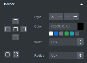
A few components can receive borders. The border widget lets you set a color, width, style on all borders or individual sides. Also, you can declare Border radius, although it's worth mentioning that it will be ignored in many legacy email clients.
# Visibility
This is a special group which gives you a set of tools for controlling when and where your component is visible.
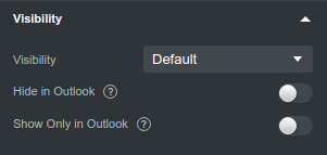
It is preferred to apply responsive styling to an element, so that it adapts to the screen size, but this is not always possible. The alternative is to design different versions of a component and show them conditionally by using these settings:
- Visibility lets you control whether the component is visible or not. You can switch between Mobile and Desktop to make this setting dependant on screen size.
- Hide in Outlook, Show Only in Outlook - compatibility with Outlook can be difficult to achieve, so in some cases it's easier to just develop an alternative version of a piece of your email for that specific client. Note that this setting applies to the desktop Windows Mail application as well, since it shares the same rendering engine as Outlook.
# Copying and Pasting
To the right of the Mobile/Desktop controls, there are a couple of small buttons. These let you copy the current element's appearance settings and paste it to another.

- Select the component whose appearance you'd like to copy and click the Copy Appearance button (the left one).
- Select the other component and press Paste Appearance (the right one).
This gives you a quick way to transfer the styling of a component to others.
# Multiselections
The visual editing workflow of Mail Studio is made more powerful with multi-selections. Hold Ctrl/Shift (for Windows and Linux) or Cmd/Shift (on Mac) while clicking, to add components to a multiselection. This lets you change their appearance simultaneously.
This is a great productivity boost for those who prefer the visual nature of the app. For those of you who prefer writing code, you can achieve similar results by assigning class names to your HTML elements and writing CSS, as laid out in our CSS guide.