# Container
Container components are an important part of building responsive email designs. Although they aren't part of the Responsive Grid, they handle the task of centering content on screen and giving the different sections of your design a consistent width.
For components that take the full width of their parent, it's recommended to drop them inside a Container, instead of directly in the body.
# Basics
Containers are 680px wide by default. This is the traditional email width that's been established in the industry, but you can easily make them wider to accommodate modern designs.
Just right click the container and choose Options...
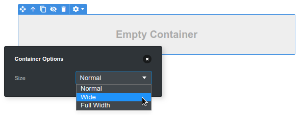
In the panel, you can the Size setting with following values:
- Normal - the default. Restricts containers to be 680px wide or less.
- Wide - choose it to make the container 800px wide. This will give more room for your content and will better reflect how people are reading email on desktop today. Your design will still be responsive and will work correctly on smaller devices, so there are no downsides.
- Full Width - this will make the container take the entire width of the page. Can be useful in cases where you wish certain sections (like your footer) to take the entire page width so that they can be styled with a background color.
Note
Wide containers in Outlook and Windows Mail are still limited to a 680px width. This is because that is the amount of space that's usually available in those programs. And since no responsiveness is possible due to lacking CSS support, the only way to prevent horizontal scrollbars is to fix the width to 680px.
← Column Layout Table →